MUJI's customers are known to be loyal fans of their stores and products. However, online sales in the US did not reflect this. I was contracted to propose changes to the visual design and usability of MUJI's US online store.
Since there was almost no information about actual MUJI customers, I conducted guerilla user interviews outside of brick and mortar MUJI stores to find out how the online shopping experience differed from the physical shopping experience. In doing so, I was able to gain insight about specific customer pain points.
I then did a heuristic evaluation of the MUJI website on both desktop and mobile devices to see if there were problems that I could identify based on my user research and established UX principles.
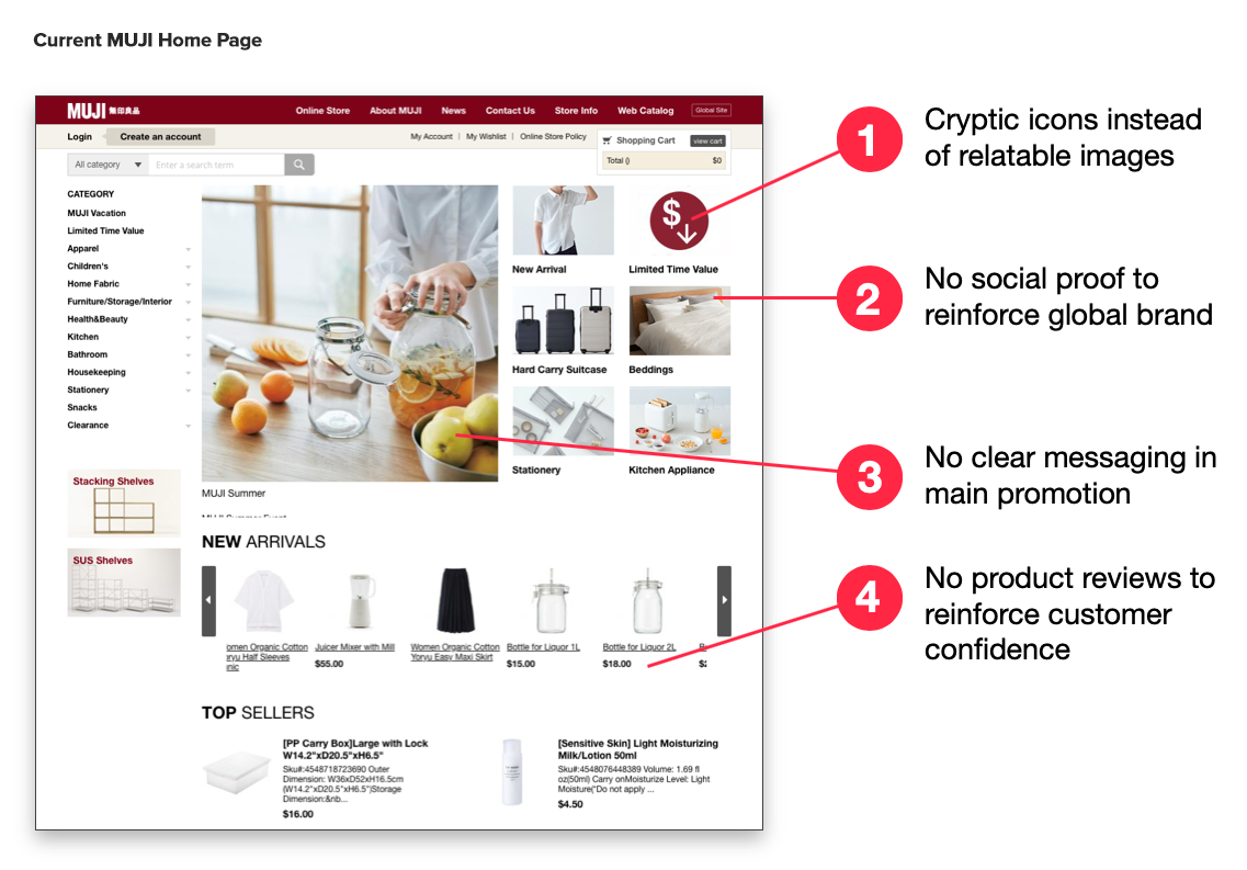
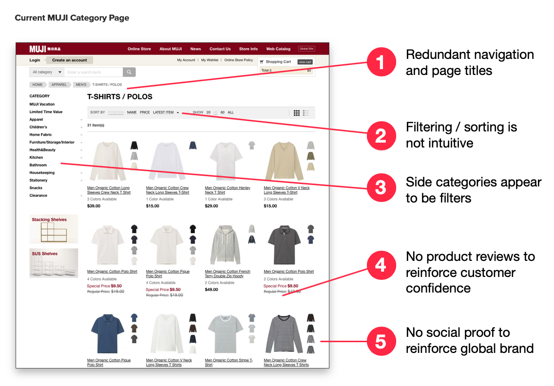
After evaluating the MUJI site, I did a comparative audit of other industry leading e-commerce sites to serve as benchmarks and identify areas where the design could be further improved.
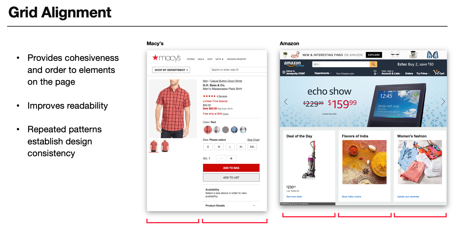
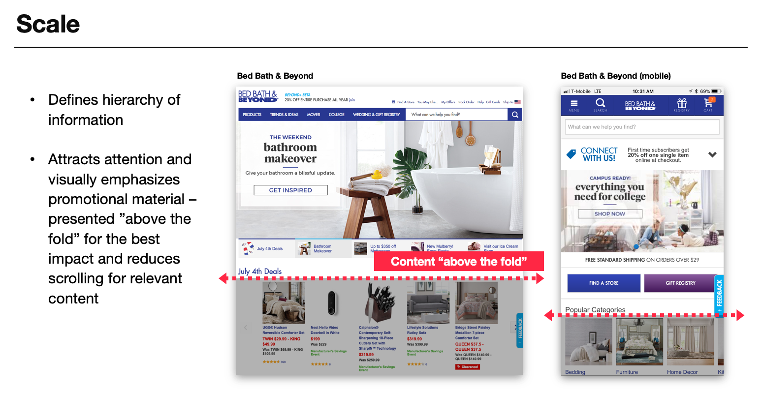
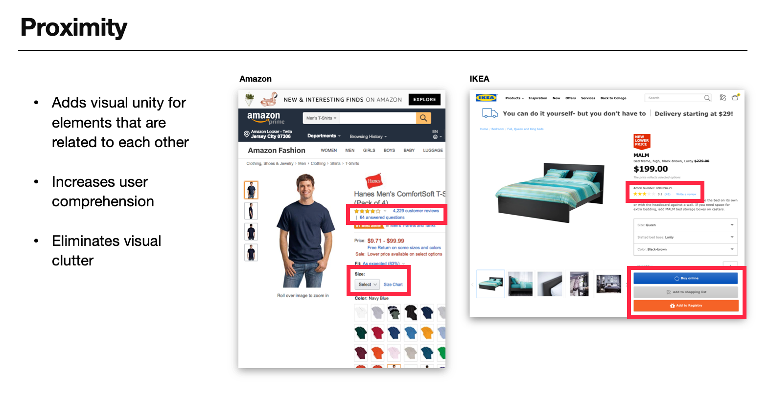
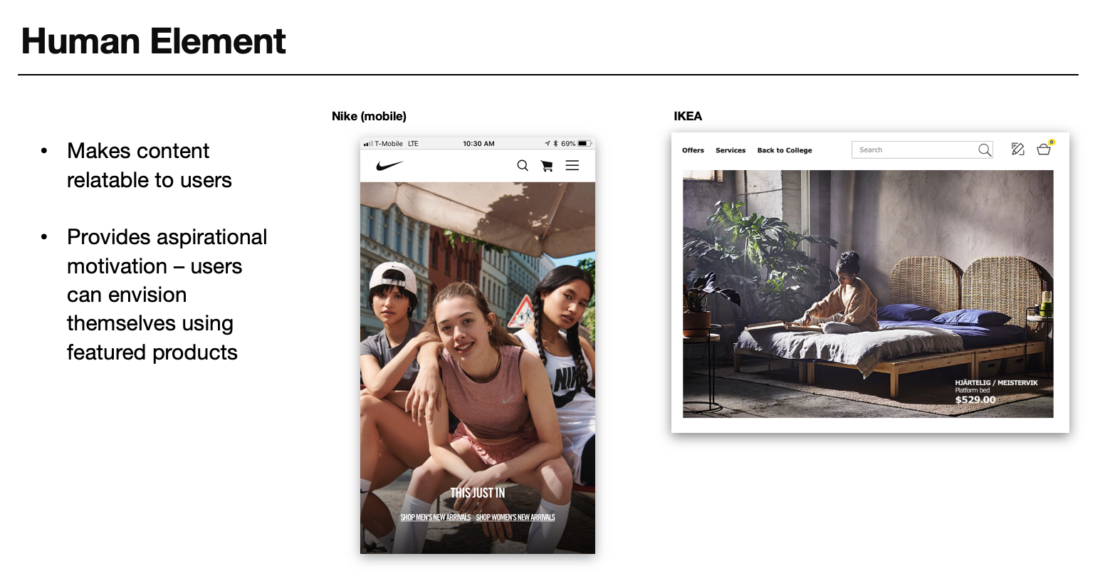
Finally, I proposed changes to MUJI's US online store based on the insights gained from my analysis of their current site design, user interviews, and comparative site research. I supported by my findings by conducting user tests between the current design and my proposed designs.
As a result of my research and design audit, MUJI USA applied my templated redesign to their new site - https://www.muji.us/store/
