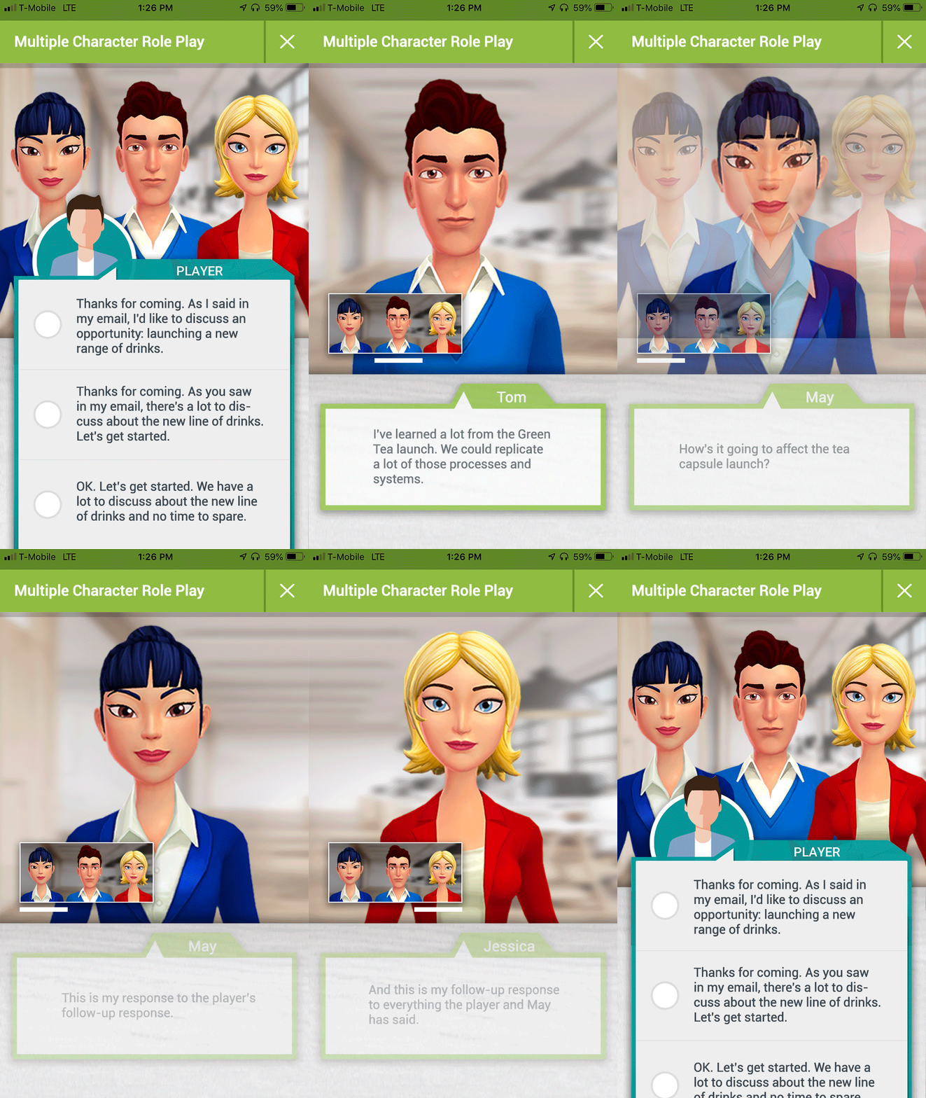
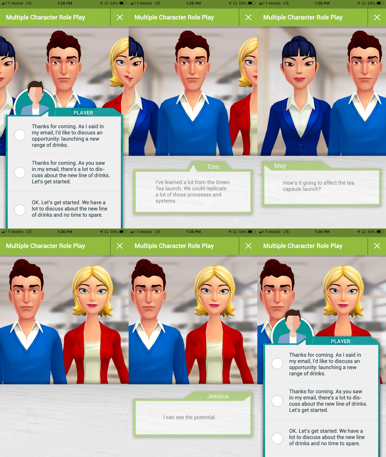
Boost is an app that helps managers become better leaders through immersive gamified learning. Instead of passively attending boring management seminars, users interact with 3D characters in real-life role plays to learn valuable leadership skills.
I was contracted by Boost to do an overall audit of their existing app and identify areas to improve the UX and visual design. The first step of my engagement involved meeting with primary stakeholders over a few days to go over their concerns with the app and learn about underlying business goals. We also reviewed qualitative feedback from current users to identify common pain points. From this, we concluded that there were two primary goals to drive the redesign of the Boost app: increase app completion and overall user competency.
The second step of my initial engagement was to conduct an overall UX and visual design audit of the Boost app. I documented redundancies that impeded overall gameplay and UI elements that could be consolidated or redesigned to be on-brand. I also discovered that even though the app addressed independent user flows, the design lacked an overarching direction that made the experience feel more unified. This was a major factor that detracted from the main goals of increasing app completion and user competency.
The next step in my process involved numerous rounds of sketching, wireframing, and reviews with stakeholders to address issues that were identified in my initial engagement. I also introduced the use of Sketch and InVision mockups as tools to streamline the iteration and review cycle.
Through the process of iteration and review, I streamlined existing user flows and established new features that were all designed to work collectively as a unified experience. I also produced animations in order to more clearly communicate my ideas to overseas development teams.
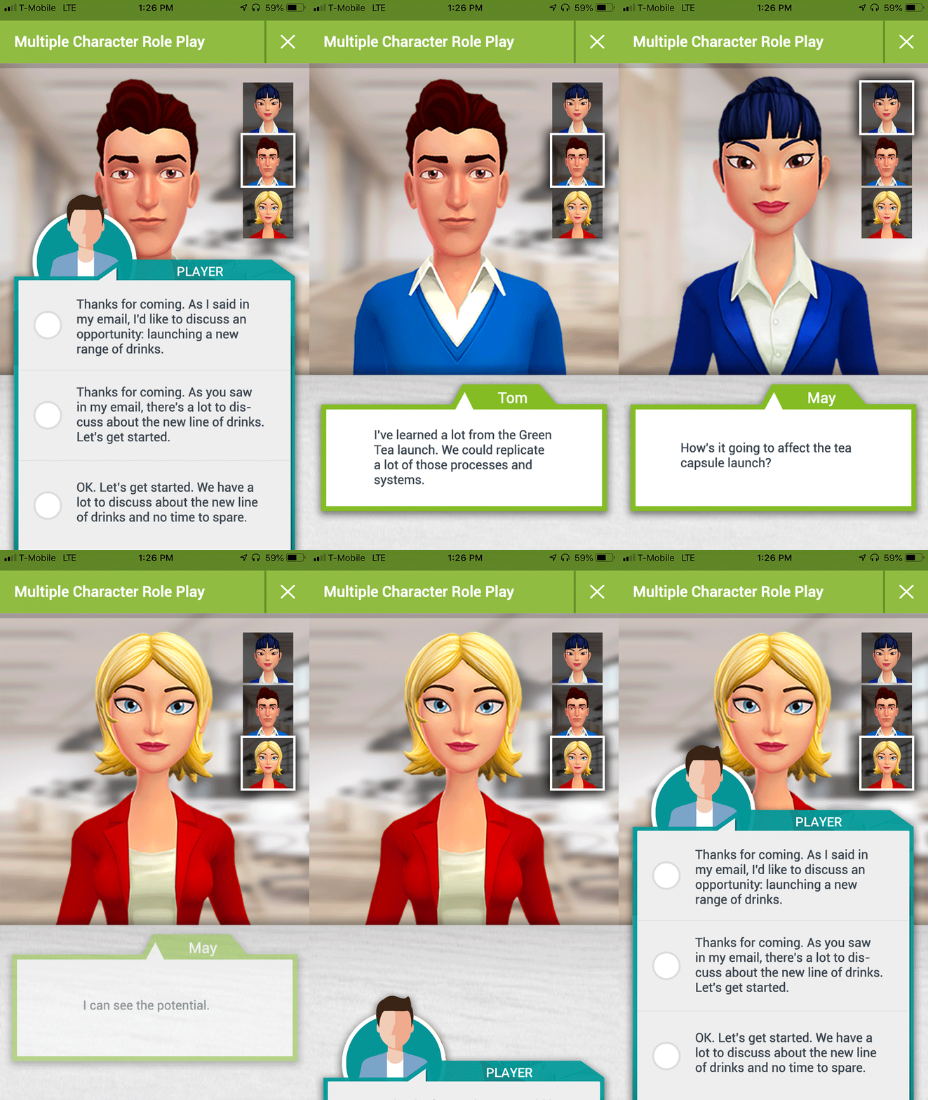
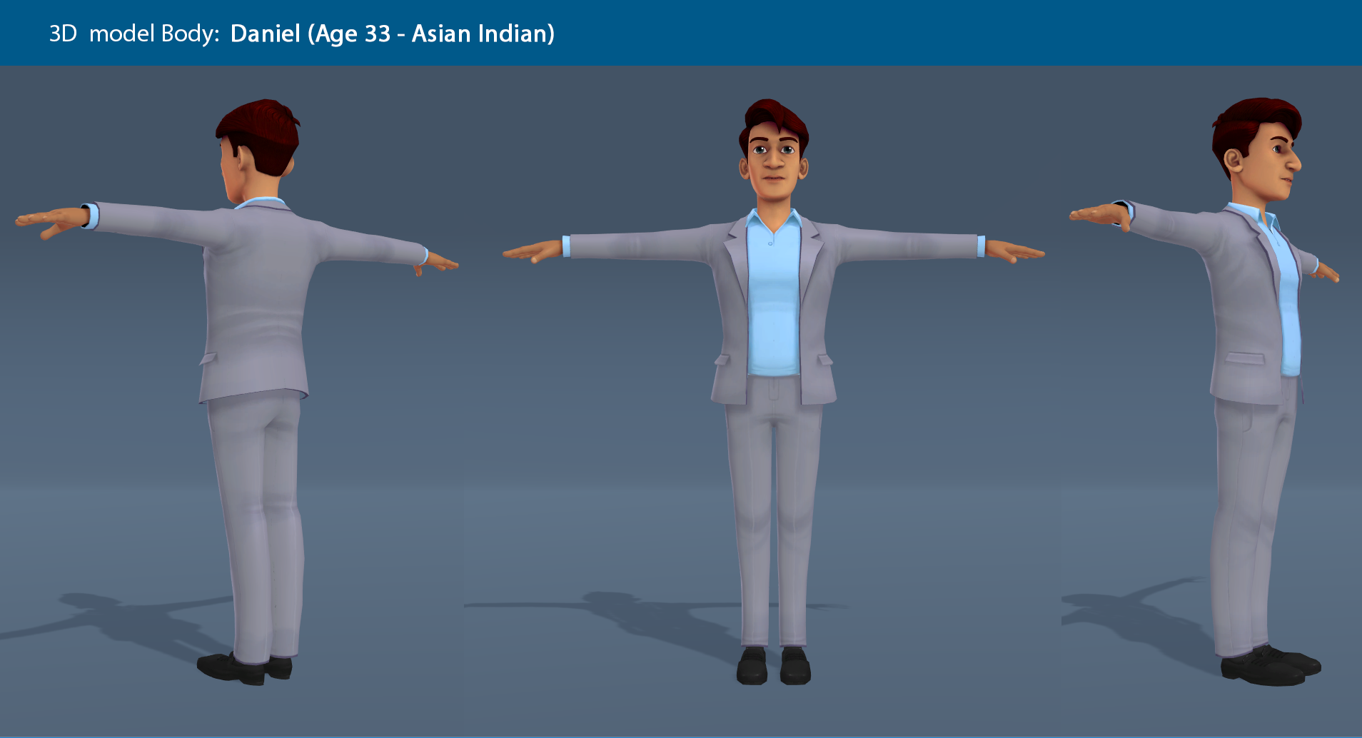
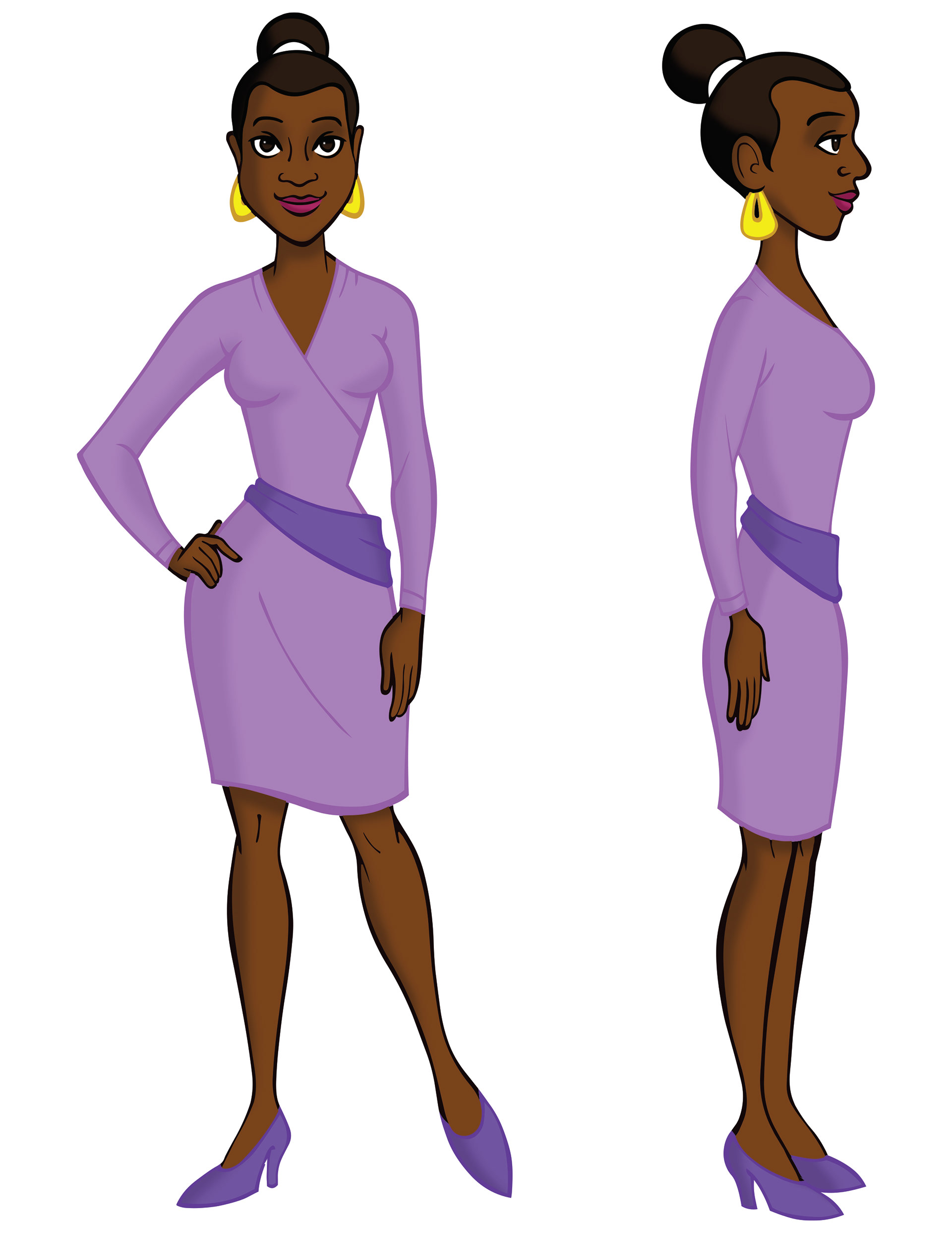
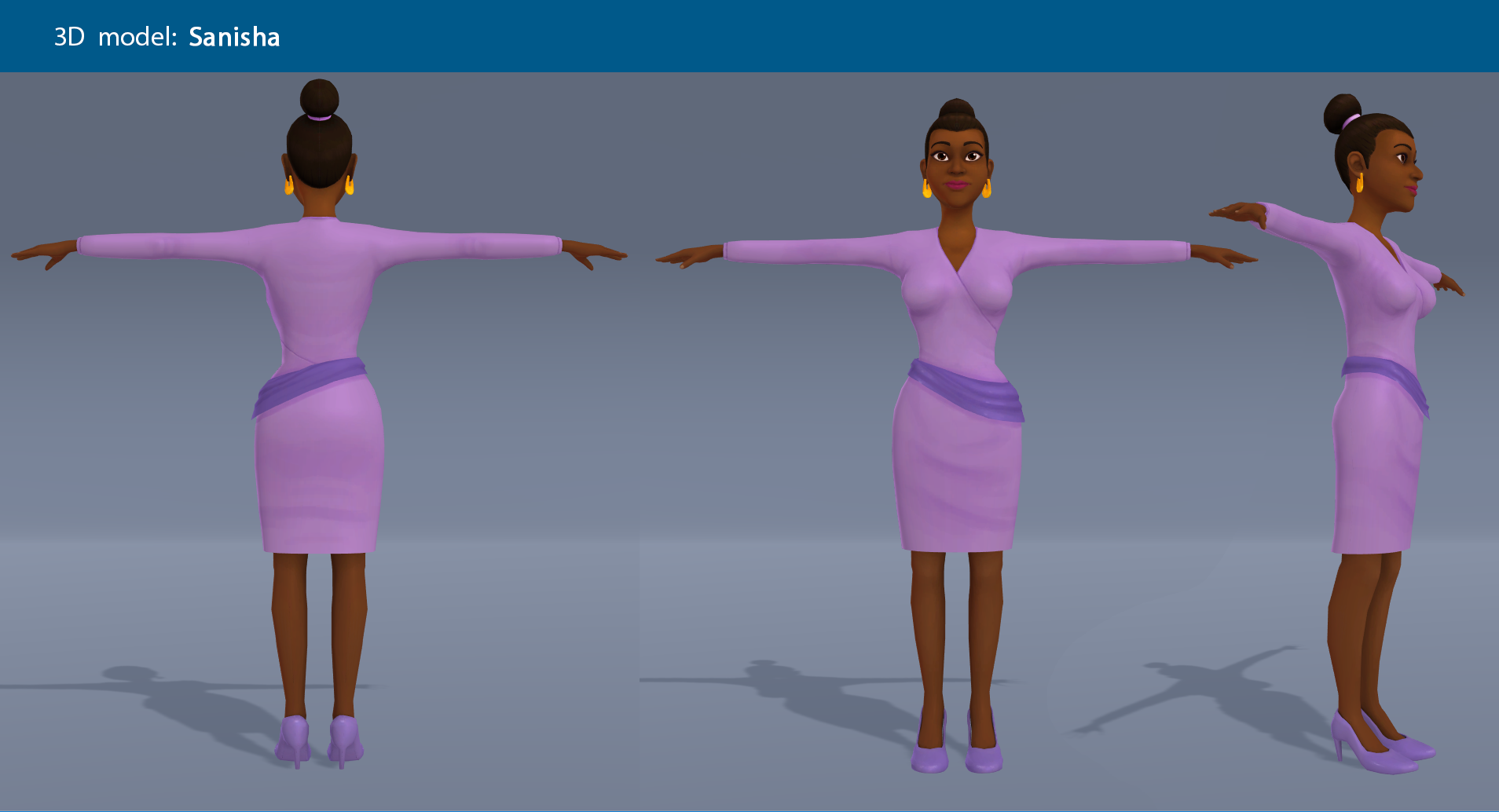
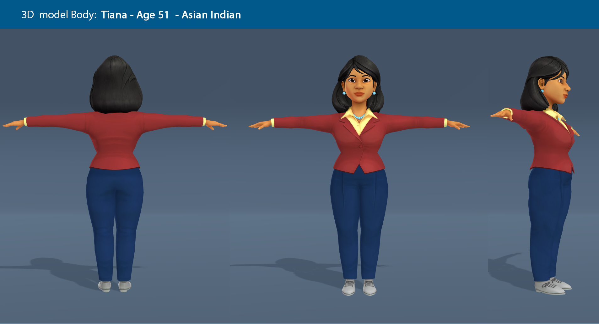
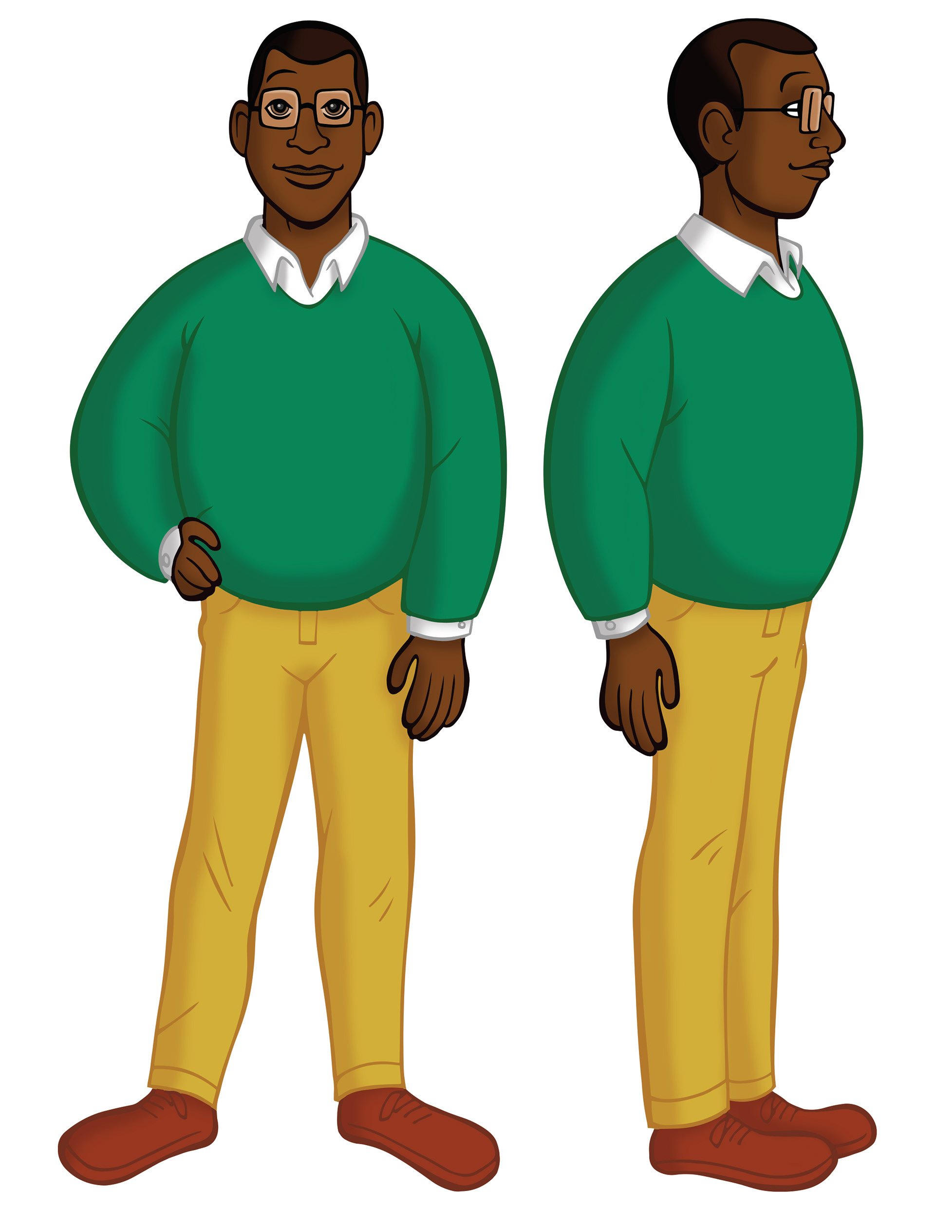
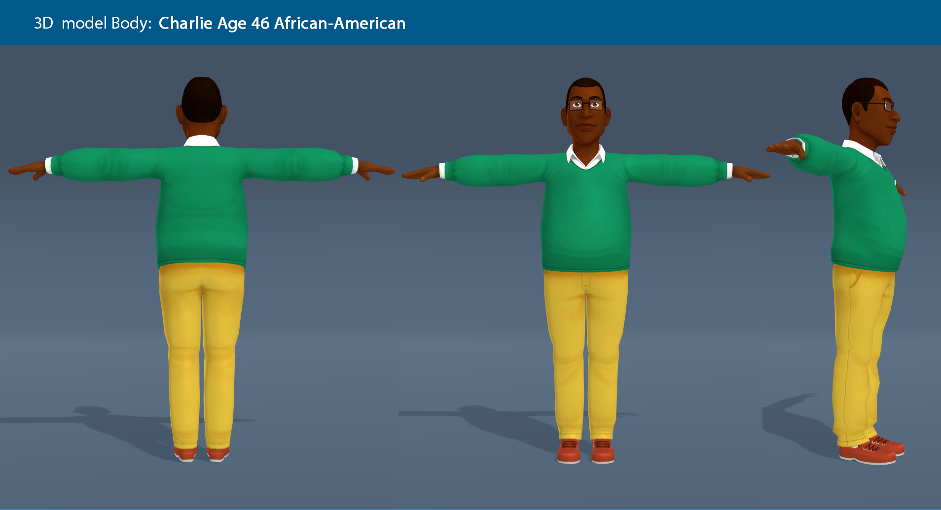
In addition to my UX and visual design work, I illustrated diverse characters that were included in the interactive role plays.
